A visual history of this website
10 Jan 2022 While I was updating this website for the Nth time, I was curious to see the evolution of my corner of the internet. Importantly, I wanted to know the story it tells about me. I’ve been writing my entire adult life, not because I have something to say (everyone does), but I believe we think when we write. Personally speaking, it’s a time for me to collect my thoughts and put words to feelings.
Obligatory thanks to Waybackmachine’s free archival service.
2007
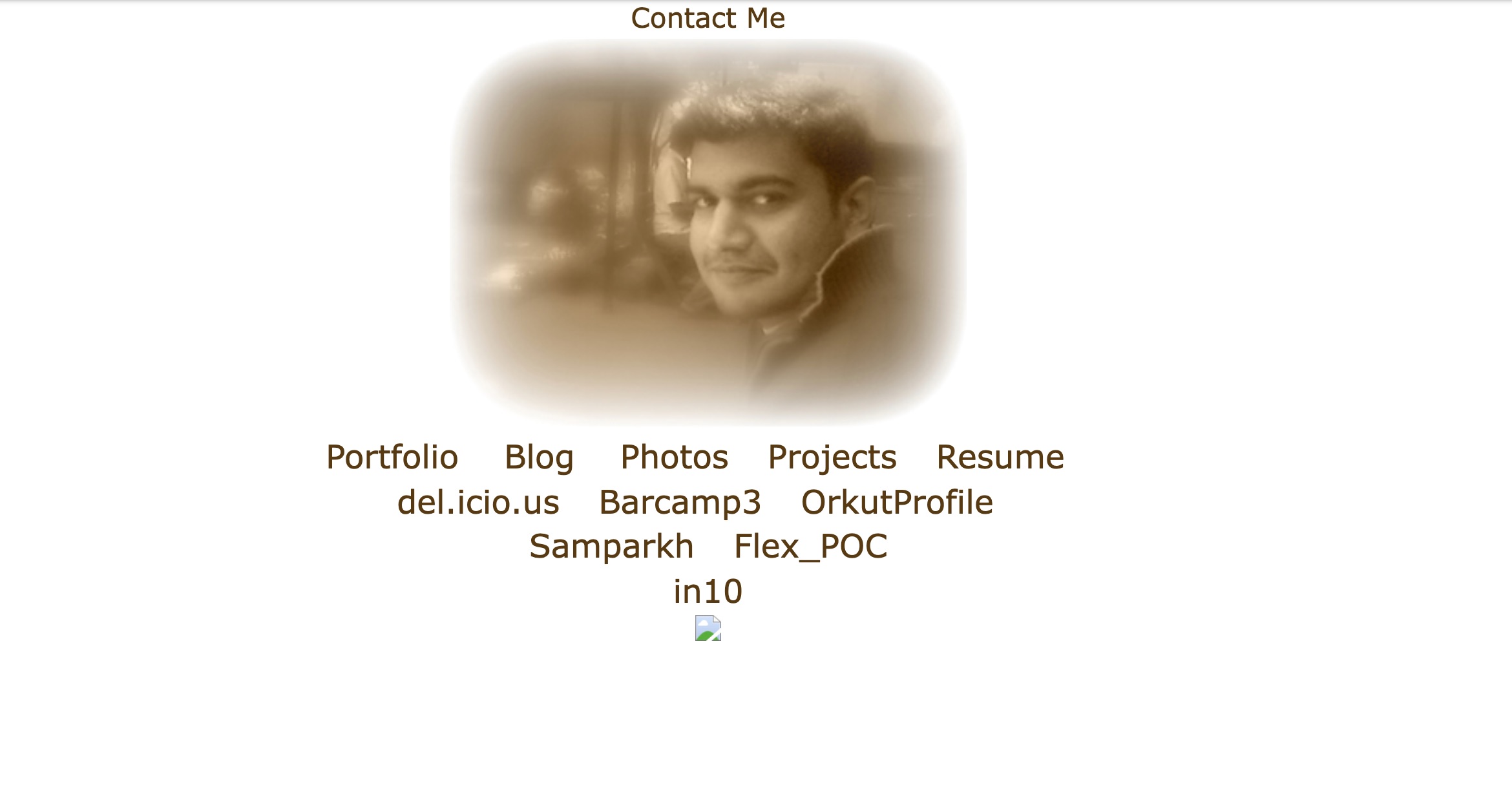
I’m not sure what prompted me to buy a domain and craft my own corner of internet. I was embracing the Web2 way of doing things, I guess. The website itself is pretty basic, only pointing to links.
2008
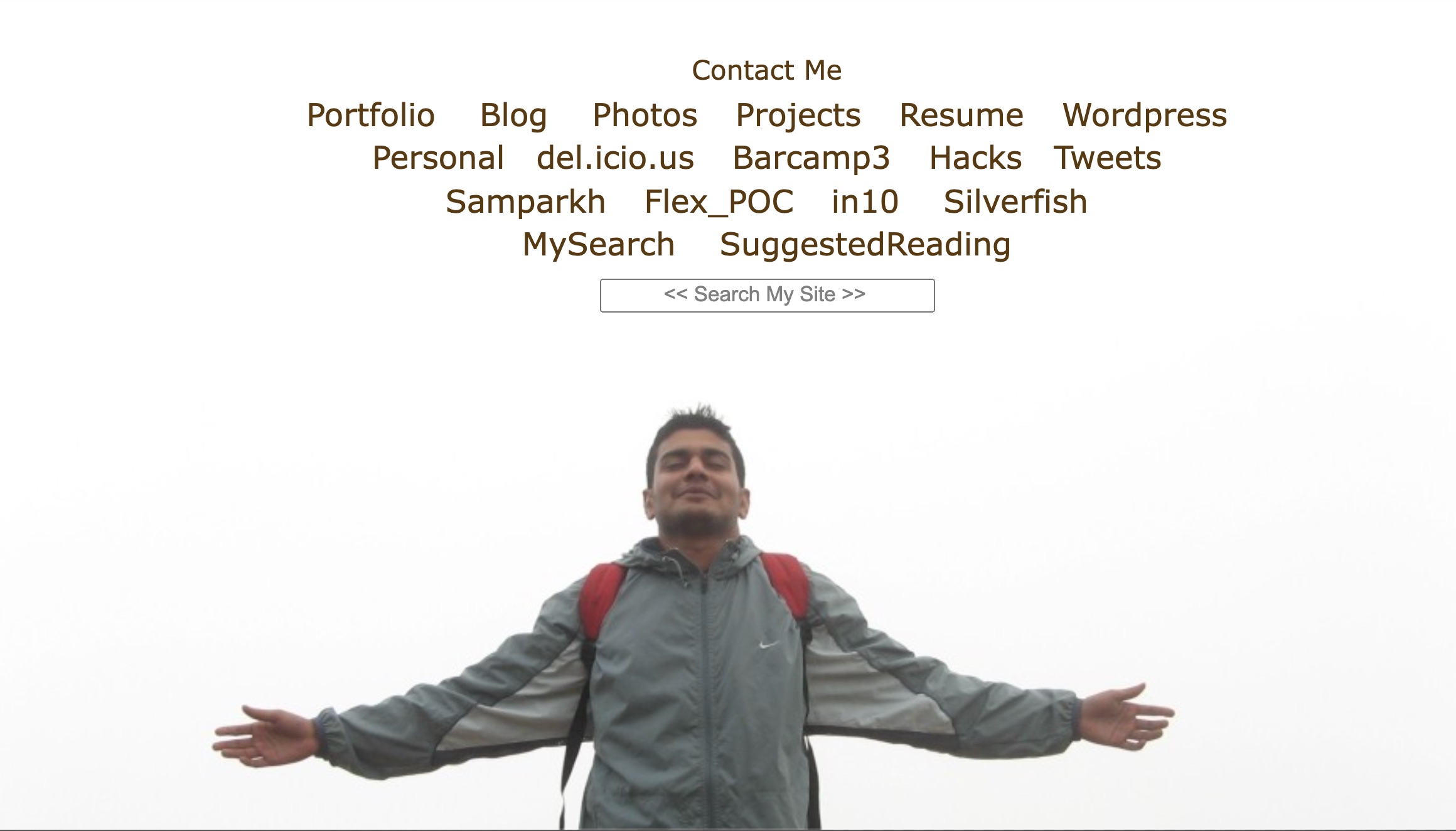
By mid 2008, I was experimenting with full bleed images and doing interesting things with CSS. Thank you Firebug :)
2009
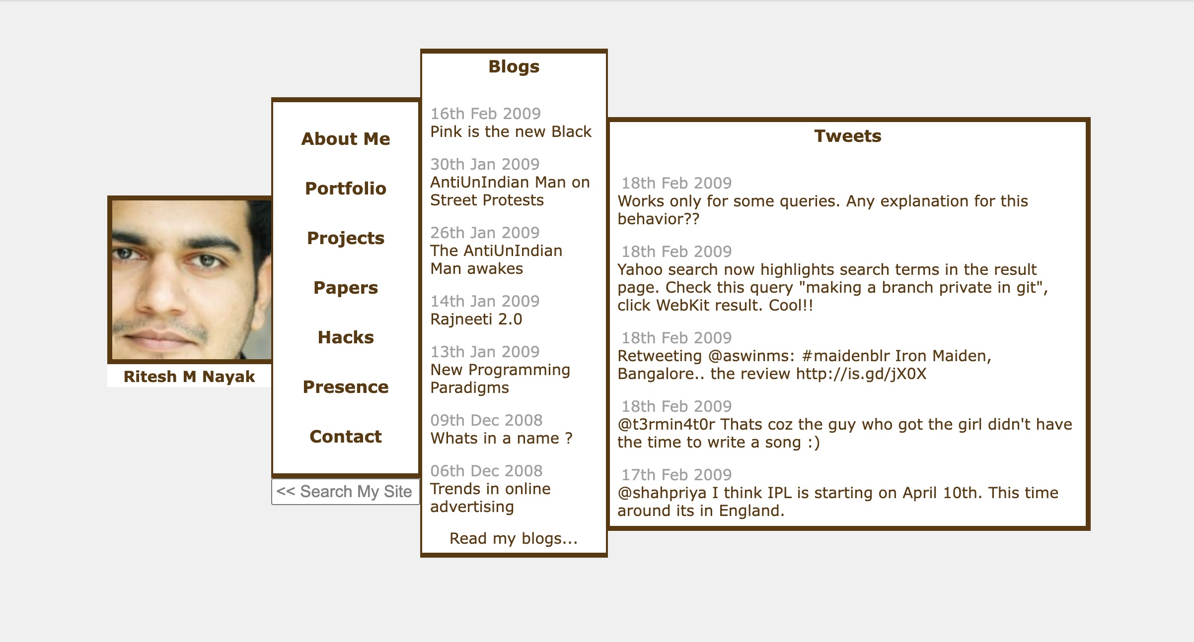
Multi-column applications were all the rage in 2009. Remember Tweetdeck? Mobile web was still in its infancy. My vision for a website facelift was to build a monochrome-themed modern site inspired by (responsive) tetris blocks.
In addition to just the engineering, I was developing a sense of aesthetics. Strange coincidence that I started photography around this time too, which in hindsight seems like another avenue to exercise the design side of my brain.
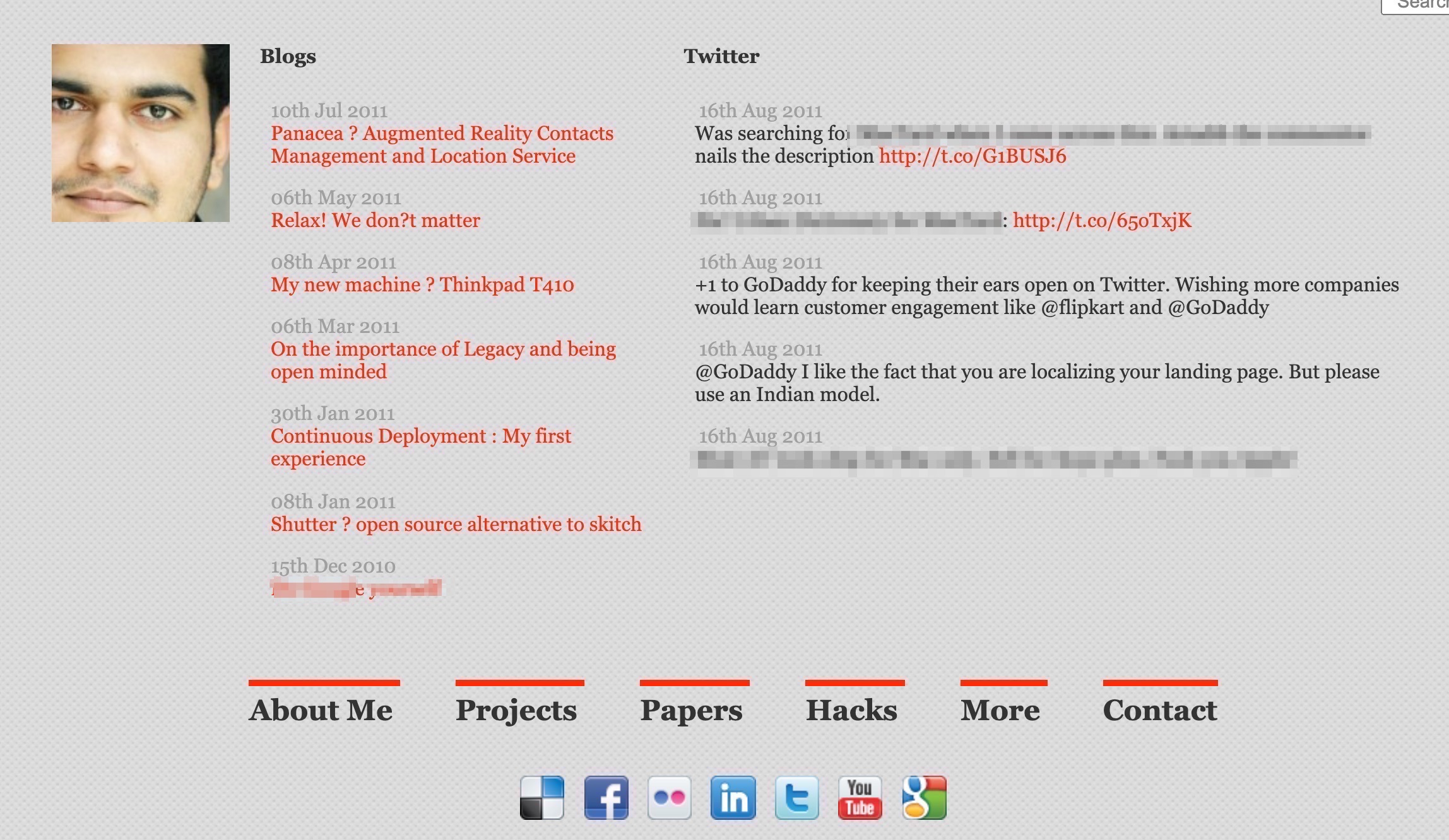
2011
Mobile web had finally arrived and my monochrome theme wasn’t doing so good. While I preserved the columnar layout of the site, I moved to CSS grids (thank you Bootstrap) and spread out the content more.
2014
I moved to the US, and soon after, we shut our startup. It was a hard time, both personally and financially. America didn’t let me work since I was on a ‘spouse visa’. It was a time of quiet reflection and introspection. I discovered the amazing public libraries in the US, filled with books I only dreamt of reading in India. I read everything I could lay my hands on and listened to all the music albums they’d let me borrow.
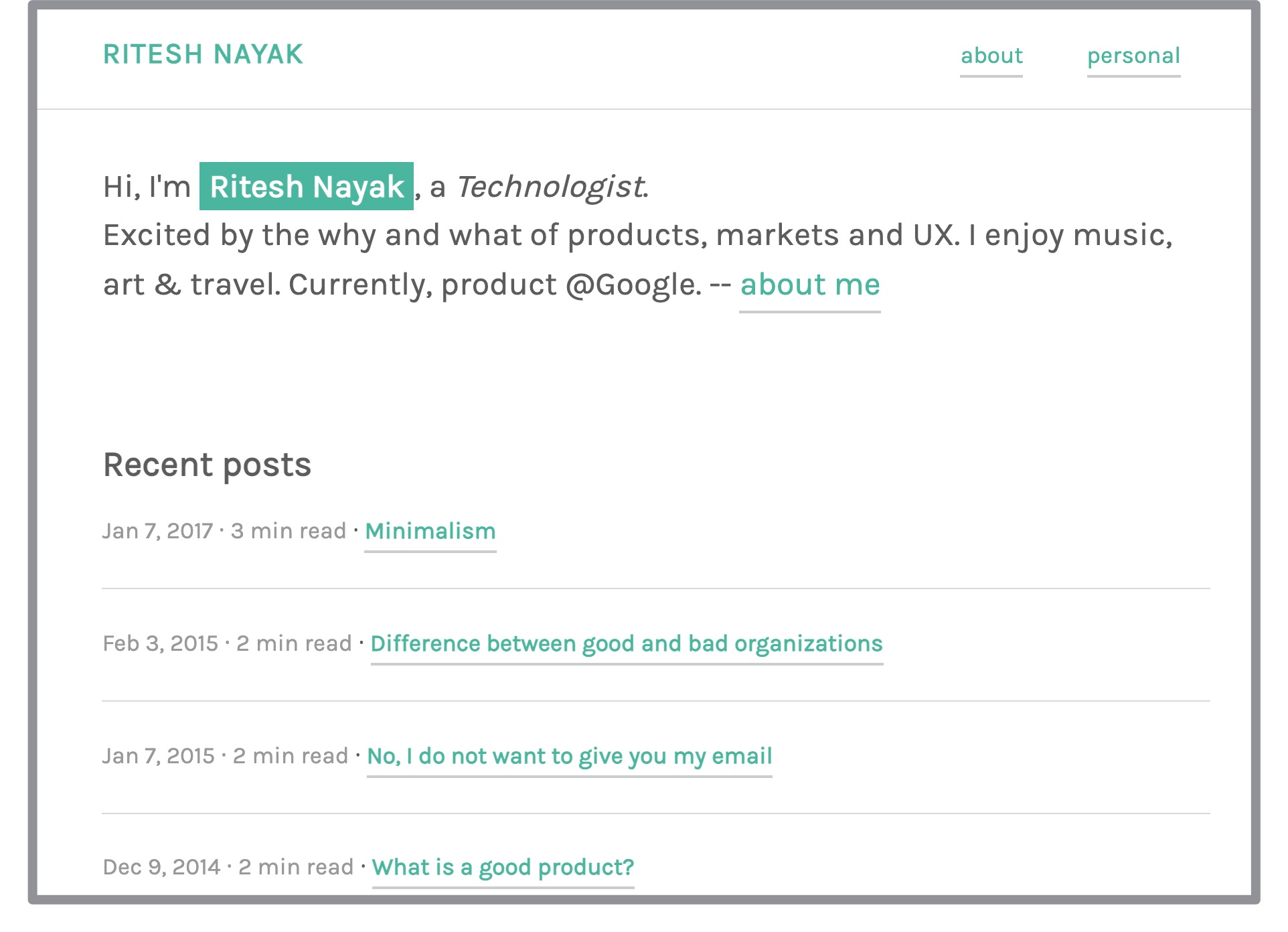
Mixed media was taking over the internet and I wanted to not deal with the vagaries of formatting and publishing by myself. I migrated whatever I could and moved my website to Tumblr. Publishing on Tumblr’s mobile app was a breeze, and their custom themes allowed me enough creative freedom while taking the hard work away from self-publishing.
In hindsight, I was settling into being a product & design person. I cared more about the content rather than how it was delivered. I tried a few different styles for the website until Tumblr shut down.
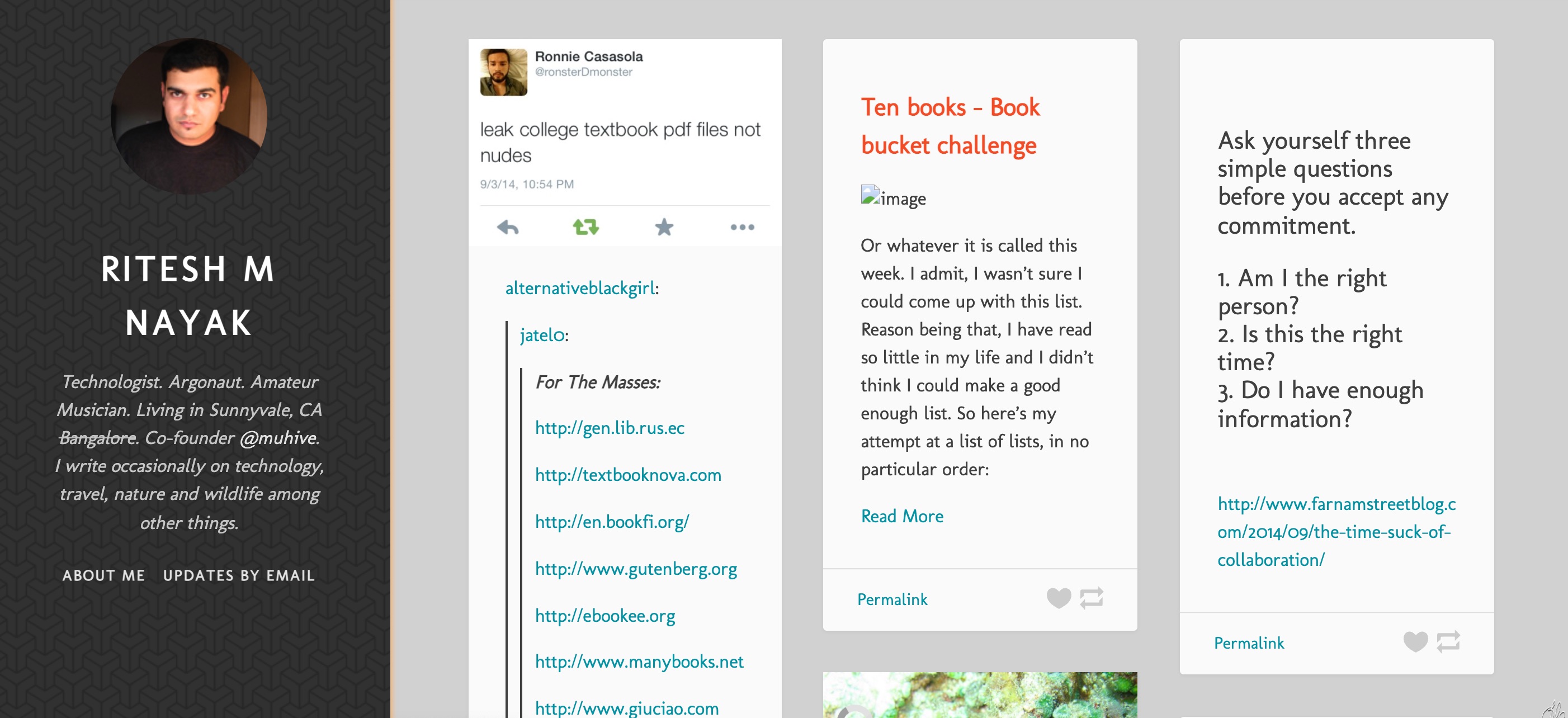
2017 version of my Tumblr site.
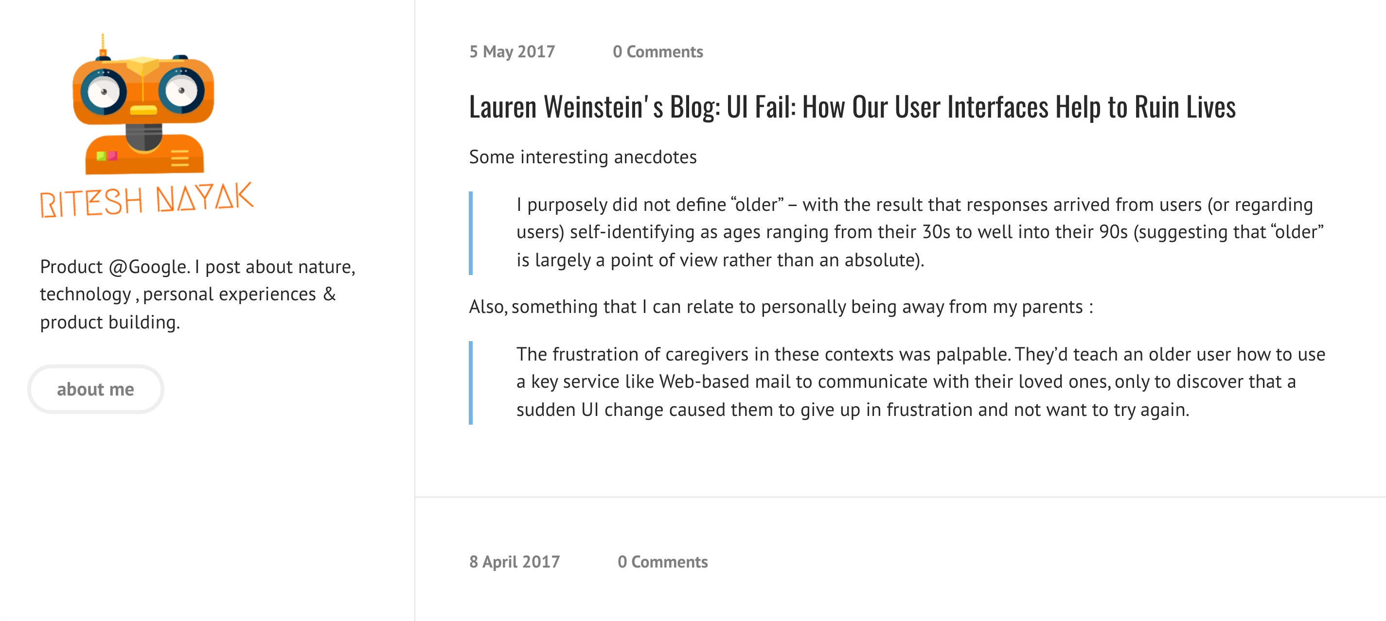
2019
Tumblr shut down in 2019. Sigh! My stream of consciousness has outlived many successful publishing platforms, and while I could have moved to wordpress/medium or any of the 50 other publishing platforms, I decided to self-publish again. This time, I picked a simple static site generator that rendered Markdown. I was already using a Markdown based workflow for my notes (first with Bear and now Obsidian), so it seemed like the right choice.
If you’ve made it this far, you’re one of a handful few who care about what I write. I hope my corner of the internet will continue to be around, giving me a voice in the world. I can’t say for sure, but if Web3 and decentralization is truly realized, this website might take the form of a dApp or you might be reading this in the metaverse.
